Journal 1 FACEBOOK
Facebook history
Facebook is a social networking service launched in February 2004, owned and operated by Facebook. It was founded by Mark Zuckerberg with his college roomates and fellow Harvard University students. The website's membership was initially limited by the founders to Harvard students, but was expanded to other colleges in the Boston area, the Ivy League, and gradually mostuniversities in Canada and the United States, corporations, and by the September 2006, to everyone of age 13 and older with a valid email address.
Facebook is a well known free social
networking website. It allow the users to create profiles, upload photos a and
video, send messages .

What is good about Facebook?
From my
personal view, Facebook is a user friendly website as:
1.
This
site, available in 37 different languanges, includes public features such as:
·
Marketplace - allows members to post, read and
respond to classified ads.
·
Groups - allows members who have common
interests to find each other and interact.
·
Events -
allows members to publicize an event, invite guests and track who plans to
attend.
·
Pages - allows members to create and promote a
public page built around a specific topic.
·
Presence technology - allows members to see
which contacts are online and chat.
2.
Several
key networking components
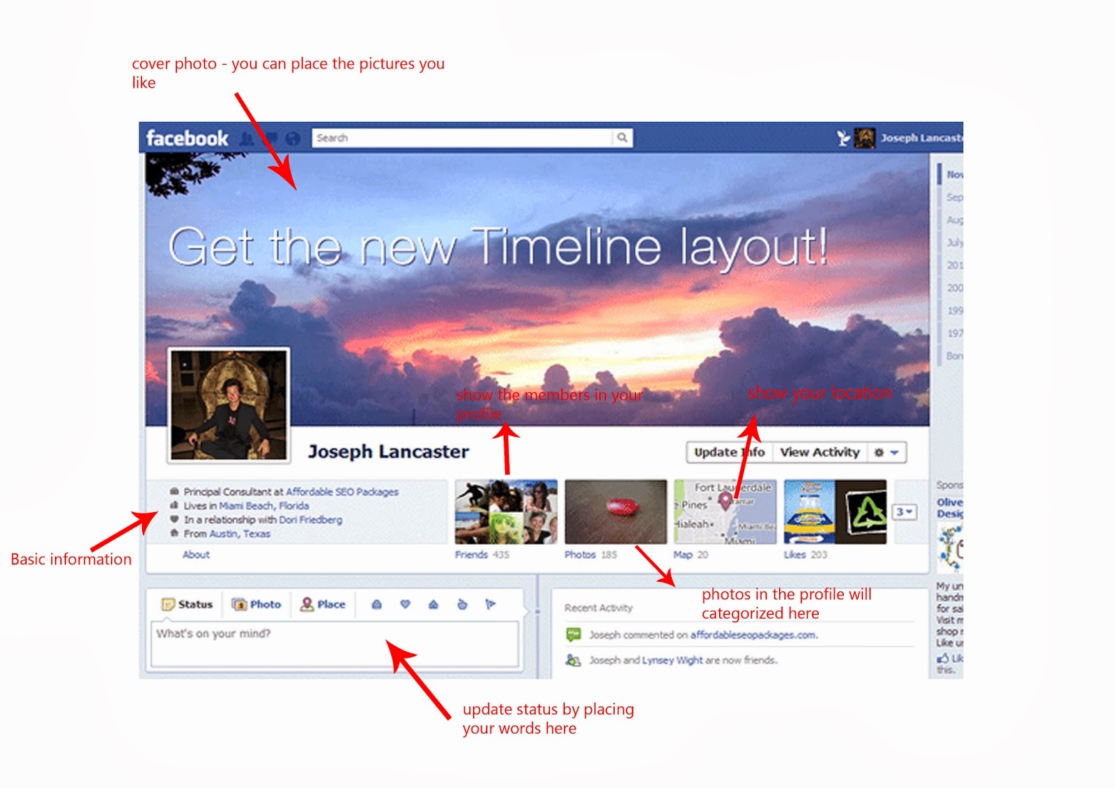

·
Wall
page
Which is essentially a
virtual bulletin board
Messages left on a member’s
Wall can be text, video or photos
·
Virtual
photo album
Photos can be uploaded
from the desktop or directly from a cell phone camera, there are no limitation
on quantity, however, copyrighted images and inappropriate images will be
removed by the Facebook staff.
·
Interactive
album features
Allow s the member’s
contacts to comment on each other’s photos and identify ( tag ) people in
photos.
·
Update
status
As a microblogging
features that allows members to broadcast short Twitter – like announcements to
their friends.
3.
Security
·
Offers
a range of privacy options
A member can make all
his communications visible to everyone, he can also block specific connections
or keep all communications private.
Decide which parts of the profile
are public, decide what not to put in their newsfeed and determine who can see
their posts.

The well
structured of Facebook have make an easy way for the user to share their
stories with friends. Each key in the website enable the user to explore and
use to build up the social network with the worlds.
Cool things about Facebook


Many of the facebook user get boring with the ordinary layout.
The questions come out
" May I change it ? "
" Can I use my own style ? "
" Can I use my own image ? "
There is an answer right now, " Yes, just as you like. " The ordinary layout of the facebook is a bit boring as all the user look the same in the page, with this improvement, I think facebook successfully develop a good platform for all the user to interact.
You can learn how to change your facebook layout, style and background here :
http://www.mazeermohamad.com/2011/03/how-to-change-facebook-layout-style-and.html
Facebook is consider as a non-linear multimedia as it offer the user interactivity to control progress. User have to clicking the key to continue with the next progress. They interactivity while chatting with the use of chat box, updating status, upload photos and so on. For this, users have the ability to move around or follow different path through the information presentation. However, there are disadvantage, the user might lost in the massive “ information highway ”. As so, my suggestion for the facebook will be : giving instruction guide for the user in order to make sure all the user fully using the website.
There is a navigation structure so call composite. User can navigate freely, but ocassionally constrained - movies, data organized in a hierarchy form. It is the form of combination of linear and non-linear. With the addition of music videos in the facebook, the facebook has transformed in the structure of composite.
Cool things about Facebook


The questions come out
" May I change it ? "
" Can I use my own style ? "
" Can I use my own image ? "
There is an answer right now, " Yes, just as you like. " The ordinary layout of the facebook is a bit boring as all the user look the same in the page, with this improvement, I think facebook successfully develop a good platform for all the user to interact.
You can learn how to change your facebook layout, style and background here :
http://www.mazeermohamad.com/2011/03/how-to-change-facebook-layout-style-and.html
Facebook is consider as a non-linear multimedia as it offer the user interactivity to control progress. User have to clicking the key to continue with the next progress. They interactivity while chatting with the use of chat box, updating status, upload photos and so on. For this, users have the ability to move around or follow different path through the information presentation. However, there are disadvantage, the user might lost in the massive “ information highway ”. As so, my suggestion for the facebook will be : giving instruction guide for the user in order to make sure all the user fully using the website.
There is a navigation structure so call composite. User can navigate freely, but ocassionally constrained - movies, data organized in a hierarchy form. It is the form of combination of linear and non-linear. With the addition of music videos in the facebook, the facebook has transformed in the structure of composite.
source : http://en.wikipedia.org/wiki/History_of_Facebook
http://whatis.techtarget.com/definition/Facebook
Journal 2 ABDUZEEDO
About author
Abduzeedo is a blog about design. There are all sorts of articles for those who want to look for inspiration. Also you will find very useful tutorials for the most used applications out there, with a special selection of Photoshop Tutorials and Illustrator Tutorials. There are other softwares conteplated like Pixelmator, Fireworks, and web design tutorials.
Goal : open channel to the design community and encouraginf their feedback
What I think about this blog ( ABDUZEEDO )?
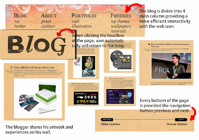
First, I would like to talk about the design of this blog. Abduzeedo design is simple and responsive. Every year Abduzeedo will try to refresh the site with new design.
- Colour palette : We can see that Abduzeedo try to create a super simple colour palatte.


- Typography : Web fonts are expanding with different options from Typekit https://typekit.com/, Google http://www.google.com/fonts and many others. Abduzeedo use Google Web fonts for a faster and reliable result. Their choice for font is Armata.

- Simple and big : home page has less text. The description text is hidden and will be visible only when you roll over the posts. The site also using bigger thumbs and bigger images in the articles.

- Well organize : each section are divide clearly and organize.We can easily search for our needs as different columns are provided with different title.

- Contents: Contents are well distributed. Steps and description is clearly, user can easily get the idea from the blog.

- Interflow : The user can commets with each of the post in Abduzeedo. With this, user can directly point out their views.

- Responsive design : Using HTML 5 Boilerplate ( build fast, robust, and adaptable web apps or sites)http://html5boilerplate.com/ and some Javascript files which had enable the site responsive for mbile, tablets and dekstop.
- Family of websites : Abduzeedo used to keep everything in Drupal CMS ( Drupal is an open source content management platform powering millions of websites and applications. It's built, used, and supported by an active and diverse community of people around the world.)https://drupal.org/index.html
- Abduzeedo launced 2 different sites : " UNEWZ " for user news and " RAWZ " for the daily inspiration submissions. These actions had make the site even more open to users. Now everybody can submit images and write posts for the Abduzeedo community.


Abduzeedo is a friendly user website. It contains many artworks, designs,videos and even tutorial for the convenient of user. The simple design had provide an easy way for the user to search for their needs rather have to waste time to explore. Abduzeedo is a website which use the navigationcomposite as the main idea. The combination with the videos , pictures and text make the user feel more enjoyable to use the website.
Source : http://abduzeedo.com/
Journal 3 N.DESIGN STUDIO ( Creative and inspiring blog )
About n.design studio
N.design studio was founded by , Nick La, a Toronto based illustrator and web designer. He is the creator of the popular blog Web Designer Wall http://webdesignerwall.com/l, Themify http://themify.me/ , Icon Dock http://icondock.com/ , and Best Web Gallery http://bestwebgallery.com/.

What I think about this blog ( n.design studio ) ?
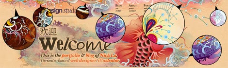
1. Amazing design for headline
The top of the web page is very different from the others in market. It is decorated by a koi fish.

Koi fish symbolizes "courage,aspiration and advancement ". According to Japanese legend, if a koi succeeded in climbing the falls at a point called Dragon Gate on the Yellow River, it would be transformed into a dragon. wiki.answers.com
- Design process of koi fish
a) sketchs
koi swimming upstream toward the sun

b) illustration sketch

c) Tracing
sketch is scanned and imported in adobe illustrator for tracing.

Below is the complete vector art in outline mode ( over 2600 paths in total ). The tracing process took about 12 hours.
 d) Coloring
The artwork was then filled with color and gradient. The images below are different color themes
that the designer tried. The coloring process took about 20 hours.


e) Texturizing
The designer then imported the elements in Photoshop in separate layers. For him. the texturing effect can easily be done by setting layer blending mode to dissolve. He used the brush and pencil tool to make the grungy background.


Source : http://abduzeedo.com/
Journal 3 N.DESIGN STUDIO ( Creative and inspiring blog )
About n.design studio
N.design studio was founded by , Nick La, a Toronto based illustrator and web designer. He is the creator of the popular blog Web Designer Wall http://webdesignerwall.com/l, Themify http://themify.me/ , Icon Dock http://icondock.com/ , and Best Web Gallery http://bestwebgallery.com/.

What I think about this blog ( n.design studio ) ?
1. Amazing design for headline
The top of the web page is very different from the others in market. It is decorated by a koi fish.

Koi fish symbolizes "courage,aspiration and advancement ". According to Japanese legend, if a koi succeeded in climbing the falls at a point called Dragon Gate on the Yellow River, it would be transformed into a dragon. wiki.answers.com
- Design process of koi fish
a) sketchs
koi swimming upstream toward the sun

b) illustration sketch

c) Tracing
sketch is scanned and imported in adobe illustrator for tracing.

Below is the complete vector art in outline mode ( over 2600 paths in total ). The tracing process took about 12 hours.

The artwork was then filled with color and gradient. The images below are different color themes
that the designer tried. The coloring process took about 20 hours.


e) Texturizing
The designer then imported the elements in Photoshop in separate layers. For him. the texturing effect can easily be done by setting layer blending mode to dissolve. He used the brush and pencil tool to make the grungy background.


f) inspiration

2. friendly user


3. Great design
Every section of the blog has a unique layout which gives a refreshing feeling.
a) Typography
The main body font size is 16 point. It is very convenient as the viewers can read the text comfortably even sitting away from the monitor. The three main fonts that the blogger have chosen are : Georgia, Helvetica, and Baskerville. Georgia is used for the main body copy. The blogger using the font sans- serif font ( Helvectica ) to provide contrast to the body type while Baskerville ( elegant font ),set for italic text and image captions.

b) multiple background images
Each section features a different background image that blends nicely with the header image.

c) Design out of the box
The blogger made the background images extend out to create the out-of-the-box effect. We can notice that the list items are also out of the box.

d) Homepage Splash
The short line of introduction briefly tells everything about the site and leads to the most important pages: portfolio, blog,about,web and illustration. The Chinese character “ 欢迎 ” mean welcome.

e) Post type icons
Each post has an icon next to it. They help readers quickly identify the category of the post. The icons are from the Rocky Vector Set. http://icondock.com/icons/sets/rocky-complete-set
f) Flexible post format
The blog's content area is designed to fit most type of content : whether it is a long or short post, with large or small images, or with videos and galleries.

g) Menu
The menu navigation is organized in column/ lists which provides easy access. When you hover over the links, it will show a tiny icon.

h) Page Titles
The blogger made the page title super large so readers can quickly locate where they are. We can notice that the fonts are randomly selected, in fact, the blogger want to create a more interesting effect.

i ) Breadcrumbs
The title's link also serves as breadcrumb navigation.


j) Animated Comment List
The animated collapsible/ expandable comment list is done with jQuery.

k) Portfolio
In the portfolio, the designer dropped the sidebar to gain maximum area for displaying large images. In this case, he did not set specific dimension for the image area so they can fit various sizes.

l) Image loader
Unlike the usual image slideshow where images are loaded and hidden by CSS, and then swapped by Javascript. In the method the designer used, the large images will only load when the user click on the circle buttons. This method have help in save bandwidth and loading time because only the requested images are loaded. The tiny animated bar ( right above the circle button ) indicates the image that is loading.

m) The art of recycling
The designer create main theme based on the Koi fish illustration, and the rest are recycled from various illustrations.
The lily pads, flying mushrooms and jellyfishes are taken from the Koi illustration.


4. Succesful
The theme in the N design studio had become one of the top used themes on WordPress.com. The theme is known as Koi ( a simplified version of N.Design's theme ). It is an artistic theme and suitable for most personal blogs. Koi suppirts the wordpress 3.0 new features such as custom menus and child themes but is still backwards compitable with older versions of WordPress.
Features
- Threaded comments
- Custom menus
- Multiple-level dropdown menus
- Header widget to add social media buttons
- One sidebar and three footer widget areas
- Custom footer text
- Child theme support
- Backward compitable with older WordPress versions


N.design studio is a very creative blog. Nick La ( designer ) had used his creativity to create a blog which is totally different from the others in the market. The outstanding idea had succesfully make it as one of the famous themes in wordpress. Blog is consider as a non-linear multimedia. It needs the user or audience to clicking in the button provided to continue with the following steps. However, in his design, it provided the user a very easy way to search for information.Besides friendly user, this blog had inspire us how interesting a blog can be.
Journal 4 Clash of Clans

Description of game


In Clash of Clans, having a strong defense is as important as having a capable offense. In many ways, defense is even more important. In Clash of clans, defenses serve to safeguard trophies and protect resources from enemy troops. Each defense has its own strengths and weaknesses, and its location in your village should reflect that.

For instance, the powerful Mortar is slow-firing, but deals incredible splash damage to ground troops. A downside is that it can't attack troops within four tiles of itself ( or air troops at all ) - so it should be placed in the center of your village with adequate protection from Air Defenses.


On the other hand, Cannons and Archer Towers deal lesser amounts of damage to groups ( as they can target and hit only one unit at a time) but attack quicker and work as an effective first line of defense.

The Wizard tower deals incredible splash damage to both ground and air units, but has a relatively short range.


away at enemy buildings so that they can then bring home some resource points for you. It provides some
welcome relief from the typically limited empire building you'll find in this and other similar games.

c) creative design concept
Clash of clans originally had a much more cartoony and casual look than its current for. In fact, the game
went through numerous visual alterations before the final look was settled on. The final agreement from
the project leader is a mixture of realism, and a "super-deformed, Japanese style"for the characters.


d) variety interactivity
As well as embarking on a campaign of pillaging across the single-player mode, you can also jump into
an online battle and fight real people.You can also team up with other players to do co-op battle against
the world.


e) interface
The interface by which you will be navigating through the game is through an isometric view of your town
including all of your buildings and villagers which will slowly grow as your expand your territory.

f) beautiful polished graphics
Clash of Clans has very well done graphics for an isometric view strategy/simulation hybrid and even
when zoomed in (the app has full pinch to zoom support) the animated sprite villagers look pretty good.
In terms of performance there are no lags, glitches or bugs and everything from the weather animations
(such as snow) to fire and puffs of smoke from building chimneys these are the nice little touches which
show the player that the developer cares about quality and is willing to put in the effort to ensure a
top-notch free-to-play mobile gaming experience.

g) sound effet
The soundtrack is very well done and is suitable for immersing the player into the game and the quality of
the sounds, especially during combat or from successfully completing a raid on a golbin camp should
keep users playing for many hours on end. The developer, Supercell also adds a nice touch with the
audio as well, supplementing the basic music with themes that are in accordance with many holidays (such
as Christmas). It shows that Supercell is willing to put additional effort into the game, adding some variety
to keep things interesting.
h) keep updating
Clash of Clans is updated every few weeks with new content -- new items, new in-app purchases, new
characters.New players can potentially become overwhelmed by hordes of content, while veteran players
may feel like new content messes with the equilibrium of the game.Supercell's solution is to only make
new content available to loyal players, and bring new players in more gradually before throwing
everything into their boat.

i) animations are limited
There are some very nice styling on both the architecture and the people as they potter around,. User
have to use their hard-earned resources to upgrade buildings and toil the land.

j) issues
The game has bugs. It can crash often for some – and if it happens at crucial times, it costs. If it crashes
after a victory and before you get home, you lose your troops and your winnings. Crashing during a
search for a suitable match means you lose the gold the match costs. Worse, you get attacked and lose
half your troops which you have to rebuild and if it was a total loss, well then, you’ve lost your play
window and have to wait for resources to refill.

k) confusing part
A bit confusingly, there are three different currencies: elixir, gold, and gems. Elixir and gold are generated
in-game and you can upgrade the mechanisms (gold mines and elixir collectors) which produce them.
Gems are the premium currency: you are rewarded them rarely (and in tiny quantities), and you can buy
them for real money. You can upgrade things that defend you by spending gold and elixir, and gems are
used mainly for speeding things up.
Comparison of Clash of Clans with other games
a) shorter time available
It requires maybe 10 minutes per day (as little as checking in for two minutes), because much of the
game is spent waiting for your buildings and other things to upgrade.
b) no energy bar limitations
Clash of Clans doesn't employ the tired energy limitations that define so many other freemium games.
Instead, advancement depends on the gold and elixir stores you amass through mines you place
throughout your encampments, which has the welcome effect of rewarding effort and dedication rather
than slamming a door in your face the moment the gameplay gets interesting.
Clash of Clans is a popular iPad/iPhone/iPod/Android game created by "Supercell". It has been available internationally on the iTunes store for free since its initial v1.7 release on 2 August 2012, and on the Google Play Store since 8 October 2013. Clash of Clans is a strategy game where players can construct and expand one's village, unlock successively more powerful warriors and defenses, raid and pillager resources from other villagers. In fact, games are consider linear multimedia as gamer had to interactivity with the character in the game. A few suggestions that I will like to comment is about the bugs. These problems had become a critical issues for all the user as it will drag us away from the game.However, this issue do not chash away the gamer. The interesting design of the game had gradually increase the population of gamer.
Journal 5 The Khooll ( digital design & lifestyle magazine )


Journal 6 You Tube


4. convenient


Journal 4 Clash of Clans

Clash of clans is an epic combat strategy game. User can
1. build and defend village
2. dominate the realm
3. battle with thousands of players across the world


For instance, the powerful Mortar is slow-firing, but deals incredible splash damage to ground troops. A downside is that it can't attack troops within four tiles of itself ( or air troops at all ) - so it should be placed in the center of your village with adequate protection from Air Defenses.


On the other hand, Cannons and Archer Towers deal lesser amounts of damage to groups ( as they can target and hit only one unit at a time) but attack quicker and work as an effective first line of defense.

The Wizard tower deals incredible splash damage to both ground and air units, but has a relatively short range.
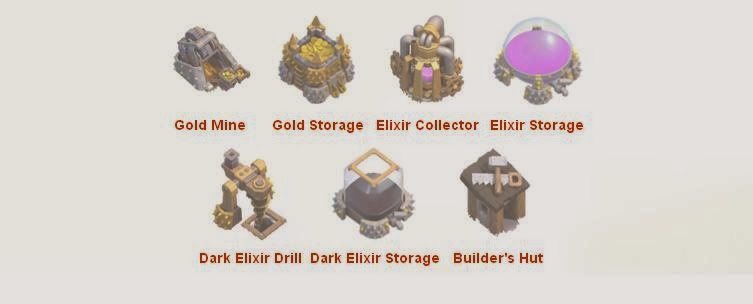
Resources are the currencies used to purchase and upgrade assets. The game has four different resources : gold, elixir, dark elixir, and gems. Gold, elixir and dark elixir all have buildings that are used for storing and generating them.

The Army section of the in-game shop that will impact the strength of your attacking army, allowing you to win more attacks. All buildings from the Army section require Elixir or Dark Elixir to build.

These buildings are those that are neither offensive, defensive, or resource-giving. However, they are just as critically important.

The Town Hall, for instance, is the heart of the village and regulates what buildings you can have, how many of them you can have, and how far you can upgrade them.

Then Clan Castle, on the other hand lets you connect with other players in a clan.Decorations are there to decorate your village. Obstacles are trees and rocks which can be found in your village. Clearing them will sometimes gives you Gems.

Troops are used against either the goblins on the campaign map, or other players in order to win Trophies and loot Gold and Elixir - this is called raiding. Troops are created in Barracks and are stored in Army Camps. Currently there are fifteen different types of normal troops, ten of which require Elixir and are trained in the normal Barracks; the other five require Dark Elixir and are trained in the Dark Barracks. There are also two Hero troops as well.
For those unfamiliar, players in Clash of Clans build forts with gold
and elixir resources. Buildings are dragged and dropped however players
like, and resources are collected and stored whenever you hop into the
game. Over time, they build an army of various troop types. They can be
taken on single player missions to raze the villages of nearby goblins,
or on raiding parties of neighboring villages. Similarly, other players
can raid your town, but don't worry, nothing is permanently destroyed
(though they can snatch some of your gold and elixir). Players earn and
lose trophies through their multiplayer raids, and band together in
clans in order to concentrate their attacks.
What I think about this game ( Clash of clans )
a) nicely design
The in-game purchasing system is designed very nicely, if you want to
continue playing with fast pace, the
only way to do this is to use real
money. Although the game mechanics are quite simplistic, Clash of Clans
gets you on the hook.
b) interesting design story
A combat system allows you to build an increasingly powerful barracks so you can send warriors into
enemy territory. You'll also need to defend your town with cannons, walls and so on. It's an idea we've
seen before, but is executed very nicely in Clash of Clans, even if it is an essentially hands-off experience.
Head to the battlefield, spam the screen with your loyal forces and watch them shoot from afar, or chopaway at enemy buildings so that they can then bring home some resource points for you. It provides some
welcome relief from the typically limited empire building you'll find in this and other similar games.

Clash of clans originally had a much more cartoony and casual look than its current for. In fact, the game
went through numerous visual alterations before the final look was settled on. The final agreement from
the project leader is a mixture of realism, and a "super-deformed, Japanese style"for the characters.


d) variety interactivity
As well as embarking on a campaign of pillaging across the single-player mode, you can also jump into
an online battle and fight real people.You can also team up with other players to do co-op battle against
the world.


e) interface
The interface by which you will be navigating through the game is through an isometric view of your town
including all of your buildings and villagers which will slowly grow as your expand your territory.

f) beautiful polished graphics
Clash of Clans has very well done graphics for an isometric view strategy/simulation hybrid and even
when zoomed in (the app has full pinch to zoom support) the animated sprite villagers look pretty good.
In terms of performance there are no lags, glitches or bugs and everything from the weather animations
(such as snow) to fire and puffs of smoke from building chimneys these are the nice little touches which
show the player that the developer cares about quality and is willing to put in the effort to ensure a
top-notch free-to-play mobile gaming experience.

g) sound effet
The soundtrack is very well done and is suitable for immersing the player into the game and the quality of
the sounds, especially during combat or from successfully completing a raid on a golbin camp should
keep users playing for many hours on end. The developer, Supercell also adds a nice touch with the
audio as well, supplementing the basic music with themes that are in accordance with many holidays (such
as Christmas). It shows that Supercell is willing to put additional effort into the game, adding some variety
to keep things interesting.
h) keep updating
Clash of Clans is updated every few weeks with new content -- new items, new in-app purchases, new
characters.New players can potentially become overwhelmed by hordes of content, while veteran players
may feel like new content messes with the equilibrium of the game.Supercell's solution is to only make
new content available to loyal players, and bring new players in more gradually before throwing
everything into their boat.

i) animations are limited
There are some very nice styling on both the architecture and the people as they potter around,. User
have to use their hard-earned resources to upgrade buildings and toil the land.

j) issues
The game has bugs. It can crash often for some – and if it happens at crucial times, it costs. If it crashes
after a victory and before you get home, you lose your troops and your winnings. Crashing during a
search for a suitable match means you lose the gold the match costs. Worse, you get attacked and lose
half your troops which you have to rebuild and if it was a total loss, well then, you’ve lost your play
window and have to wait for resources to refill.

k) confusing part
A bit confusingly, there are three different currencies: elixir, gold, and gems. Elixir and gold are generated
in-game and you can upgrade the mechanisms (gold mines and elixir collectors) which produce them.
Gems are the premium currency: you are rewarded them rarely (and in tiny quantities), and you can buy
them for real money. You can upgrade things that defend you by spending gold and elixir, and gems are
used mainly for speeding things up.
Comparison of Clash of Clans with other games
a) shorter time available
It requires maybe 10 minutes per day (as little as checking in for two minutes), because much of the
game is spent waiting for your buildings and other things to upgrade.
b) no energy bar limitations
Clash of Clans doesn't employ the tired energy limitations that define so many other freemium games.
Instead, advancement depends on the gold and elixir stores you amass through mines you place
throughout your encampments, which has the welcome effect of rewarding effort and dedication rather
than slamming a door in your face the moment the gameplay gets interesting.
Clash of Clans is a popular iPad/iPhone/iPod/Android game created by "Supercell". It has been available internationally on the iTunes store for free since its initial v1.7 release on 2 August 2012, and on the Google Play Store since 8 October 2013. Clash of Clans is a strategy game where players can construct and expand one's village, unlock successively more powerful warriors and defenses, raid and pillager resources from other villagers. In fact, games are consider linear multimedia as gamer had to interactivity with the character in the game. A few suggestions that I will like to comment is about the bugs. These problems had become a critical issues for all the user as it will drag us away from the game.However, this issue do not chash away the gamer. The interesting design of the game had gradually increase the population of gamer.

"The kholl" is a digital design & life style magazine. Life style magazine is an umbrella term for popular magazines concerned with life style.There is no universally accepted definition of what is lifestyle magazine about. However, it is commonly be known that what is men's, women's sports car, health and fitness, tourism, leisure,decorating, culture magazine is. The concept is chiefly used in reference to a magazine's tone.

Before going through the contents of the blog, blogger had mentioned earlier none of the images, work or art displayed here own by them.
What I think about this blog? ( The Khooll )
1. Simple design for theme
Instead using the colourful themes in creating the blog, blogger had choose a simple colour to lighten the blog. Only three colour are using through whole blog, which is : black , grey and white.

2. Simple constructed headline
By using two colour to make a construct of the word, blogger successfully create a impact for the viewer
about what the blog name is.

A small detail apart is that the headline not just a headline, it provide a function of the viewer for
just clicking it, it will automatically direct the user to the homepage no matter which section you stuck at.
3. Systematically
Data are divided systematically. Menu bar is provided with different column provided.


4. convenient structure perform
It will be very inconvenient if every time we want to jump to the next column if we are already
situated at the far below of the page. The blogger had make us the advance by putting the
column in each below of the page. A very easy way for all the user to search for their next
needs.

In my point of view, it is a bit boring about the blog. Although the blogger want to show the simplicity of the blog, but the colour using will get the user feel unattractive. In the other hand,i t will be more convenient if each of the page is with the page title. It will simply remark the user which area is he or she situated. Blogger also can add some fun elements others than just image. Overall, the concept of the blog is good, as it show clean and simple views, however for a long-term manage, add in some cheer elements will eventually increase the viewer population.
source : http://khooll.com/
YouTube began on February 14,2005 when three former PayPal employees activated the internet domain name "YouTube.com" and started to create a video-sharing website on which users could upload, share, and view videos.
What I think about YouTube?
1. clean interface
The overall impression given by YouTube is neat. Everything is in specific position and is clear viewing.

2. organized
The left sidebar lists all your subscriptions and you can see the number of recent videos from each
subscription. There's also a search box that lets us find a subscription.


3. center-aligned layout
If we noticed that, the video page is at the center.The sidebar looks nice, but it is hidden by default. Since the sidebar is hidden by default, there is more room for videos. The YouTube has two tabs for
"What to watch" and "My subscriptions", while the header is persistent.


a) friendly user
When user subscribe to his favourite channels, Youtube will add them to the Guide and make them
available on every page of the site, and also in the mobile device, tablet and TV. The guide is actually a
sidebar that s now available on every YouTube page and let the user check for their subscriptions,
playlists and the video history. User also can see a list of other videos from the previous page, provide can
quickly watch another search result, a different video from the same channel or another video from the
homepage.

b) side by side comparison
The side by side comparison of the left account column illustrates that point in a very clear way. Instead of the tab mash next to your profile picture, you can choose the only two tabs : "Watch later" and "Watch History", making the area around the profile picture more usable.

c) music and entertainment tabs
The music and entertainment tabs were incorporated into Recommended tab, where user are offered videos that may be of special interest for you. To emphasize this point, YouTube provided each
recommendation with a small explanation as to why you can like it, which gives you an ides about what
you can expect from this video.

d) Subscriptions section
User having a quick access to the channels subscribed to. A very nice stroke is user is now
dispalyed the number of new videos uploaded to the subscription channels since last visit.

e) player buttons
A single button is displayed on the player's toolbar instead of individual buttons for changing the
player's size, the video's quality or toggling annotations on or off. A click on the button displays all
three options in a menu that opens up. Annotations and player size can be changed with a single click
on the option that is currently not selected. The video quality menu comes with its pulldown menu
dispalying all levels of quality the video is available in.
The player toolbar itself displays the following options:
- play/pause button
- volume to change the volume of the video
- current time and overall playtime of the video
- the watch later icon
- the combined menu that displays annotations, player size and quality
- the full screen window icon


Although YouTube is a good mass media for us to share videos and comments however there are some negative sides. Issues with spam and abuse in the new comments are a difficult problem to be solve. In order to solve this critical issue, on November 6, 2013, Google implemented a new comment system that requires all YouTube users to use a Google+ account in order to comment on videos and making the comment system Google+ oriented. The changes are in large part an attempt to address the frequent criticisms of the quality and tone of YouTube comments. They give creators more power to moderate and block comments, and add new sorting mechanisms to ensure better, more relevant discussions.